InvGate Service Management has a brand new Request View to improve our users' experience — while keeping all the details service desk agents need to process tickets right at hand.
At InvGate, we’re always looking for ways to improve our UX/UI to provide our users with a better experience. And that means listening to their feedback and turning it into action. This is why we improved the Request View in InvGate Service Management. We wanted to facilitate fast and powerful navigation for users, offering a clearer view with less visual noise — which involves more contrast when needed, and less contrast when not.
The Requests section is one of the most used, that’s why we wanted to make it even more user-friendly, intuitive, and attractive. This update is available now on InvGate Service Management.
Let's take a look at what's changed.
New Request View details
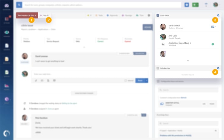
The first thing that catches our attention when we enter the Request View is that the color of the background has changed so it has a better contrast with the icons, which translates into better visibility.

In detail, the changes are as follows:
(1). The waiting status menu has an updated look and feel.
(2). The metrics button that shows the request’s timeline is also placed in a more reachable place.
(3). For adding collaborators and watchers, now there’s a PLUS "+" button on “Participants.”
(4). The same concept was applied to “Relationships” for adding a [RELATED] request, a major incident, or a problem.

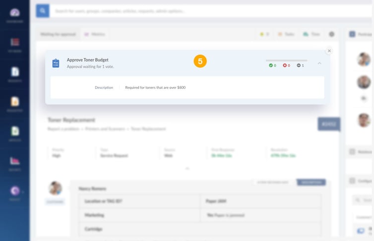
(5). There are changes in how approvals are displayed, matching the look and feel of the rest of the ticket.

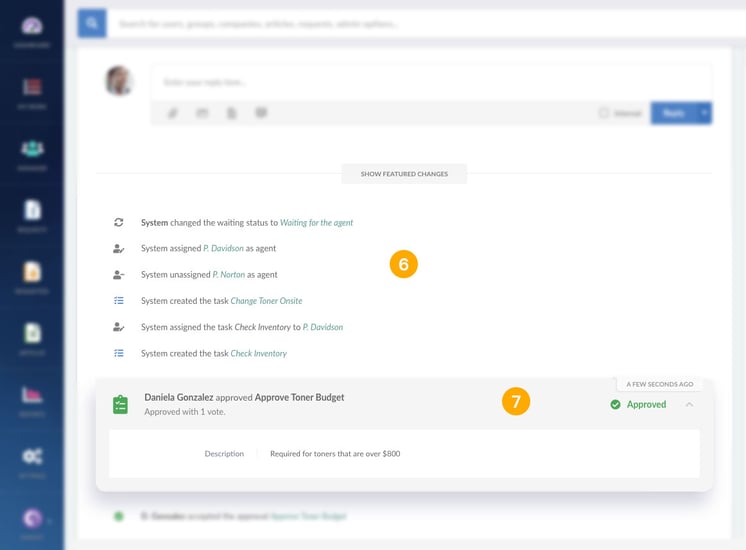
(6). Every time the status of the request changes, there will be a new history log. It will show not only the waiting status change but every other property also.
(7). Workflows are displayed in a new and clearer way.

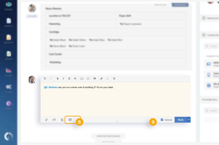
(8). The canned responses option is now located below the writing message box.
(9). There is a new way to send private comments, with a box to mark in the comment section.

If you want to find out more about Service Desk, schedule a demo with our team.
|
 |
