The process of looking for a suitable software to work with doesn’t involve its functionalities and integrations alone. It’s not limited to your company and your own needs, either. Finding a tool that does everything you want is the ultimate goal, but if the layout is confusing or if the learning curve is too steep, the dream can rapidly become a nightmare. For that reason, besides features and needs, you should also focus on the laws of UX.
In general, UX - or user experience - is the way in which users interact with a product, a system, or a service. According to the Nielsen Norman Group, “true user experience goes far beyond giving customers what they say they want. In order to achieve high-quality user experience in a company’s offerings there must be a seamless merging of the services of multiple disciplines, including engineering, marketing, graphical and industrial design, and interface design.”
As you can see, the diverse areas of expertise involved in a good user experience make it a complex thing to achieve. And a desirable one, too, because it contributes to the adoption of a product or service.
Luckily, there are laws of UX that help professionals select products, build custom solutions, or design usability studies within certain principles. They act as guidelines or agreements on characteristics known to improve user experience.
So, if you’re an IT manager in charge of making decisions on purchases or a products’ aesthetics, we’re about to make your process easier. Here are seven laws of UX you should definitely take into account!
7 laws of UX for IT managers
The laws of UX were originally compiled in product designer Jon Yablonski’s book “Laws of UX.” There are 21 of them, and their goal is to “make complex psychology heuristics accessible.” This way, they can be used to build more intuitive, human-centered products and experiences.
Here, we summarize seven of them and include examples so that it’s easier to understand how to put them into action.
1. Aesthetic-Usability Effect
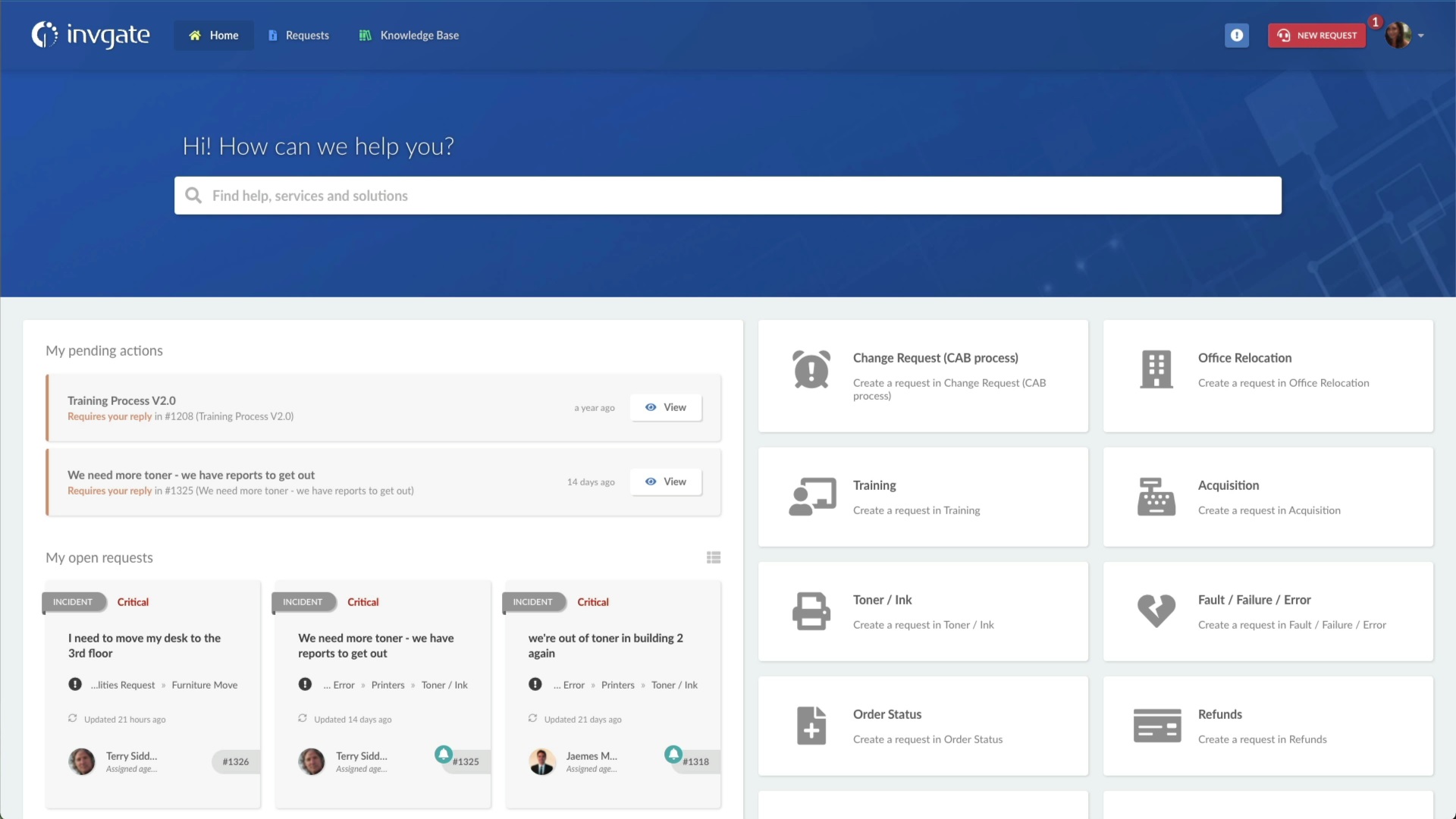
This one is almost a no-brainer: aesthetic designs are perceived as much more intuitive. And if something is pretty in the eyes, it creates a positive response. Users are more inclined to use it, and they may even believe the design actually works better.
InvGate Service Management’s end-user portal is a great way to see the first law of UX in action. Employees want a good-looking portal that makes it easy to get what they need and get right back to work.
2. Doherty Threshold

Do you also get anxious when you click somewhere and the response takes what seems to be ages? Well, this law of UX refers exactly to that. The Doherty threshold is linked to the response time within digital tools.
Platforms, sites, and software should react at a pace that ensures users don’t need to wait for the system to respond. It gives them a sense of being in control of the situation and encourages them to keep navigating. Plus, it contributes to productivity.
The ideal goal for that to happen is that a computer and its users interact at a pace of less than 400 ms. If that’s not the case, try to keep them entertained during loading time. A nice animation has the power to avoid the idea of malfunctioning - it’s evidence that something is happening - and that awful sense of wasting time.
That’s also a guiding principle of InvGate Service Management, increasing the chances of agents and managers to use it daily - and making the end-users gladly come back.
3. Law of Common Region
The third law of UX consists of grouping things, and advocates for the creation of clusters of elements delimited by clear boundaries. This practice helps users understand and establish quick relationships between elements.
So, the best practice, in this case, is to apply visible containers, as can be seen in our example. InvGate Service Management dashboard displays different common areas, easily identifiable not only by the lines surrounding them but also by categories (such as "My pending actions" and "My open requests").
4. Fitts’s law
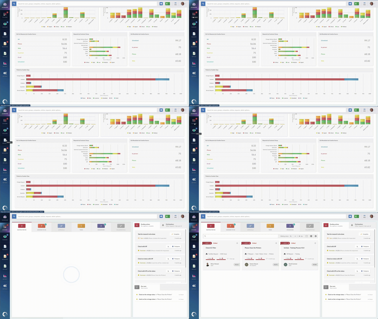
Fitts’s law points out the amount of time it takes to reach a target, based on the distance to and the size of said target. The learning behind this is that it has to be always at hand - meaning easily spotted and quickly reachable.
You can notice this law of UX at work in our primary navigation in the left margin of the screen. Since the menu items are used all the time, we make them large and easy to hit targets. This keeps navigation smooth and simple without taking away valuable space or having to hide them away.
5. Hick’s law
And speaking about targets, the concept behind Hick’s law is that the more choices you present your users with, the longer it will take them to reach a decision (if they reach one at all).
It’s about finding the balance between giving options to choose from but trying to keep the process simple at the same time. This way, users don’t get overwhelmed or even paralyzed. After all, the whole point is for them to interact with the tool (hopefully without exhausting them).
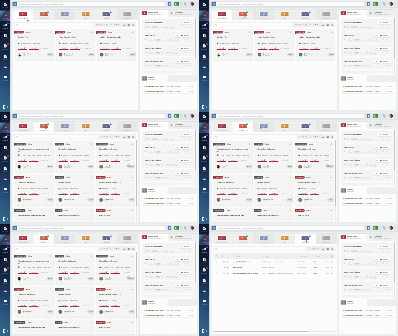
The “My Work” section of InvGate Service Management follows this law of UX and reduces complexity - it’s easy for agents and managers to prioritize work because the tool automatically presents tasks and work that requires the users’ attention.
6. Miller’s law
Moving forward, the next law of UX focuses on the number of objects an average person can hold in working memory - which is about seven. Due to the fact that the attention span is limited, it has to be used wisely. Hick’s law, for instance, reduces the number of choices. But there are other ways to help users.
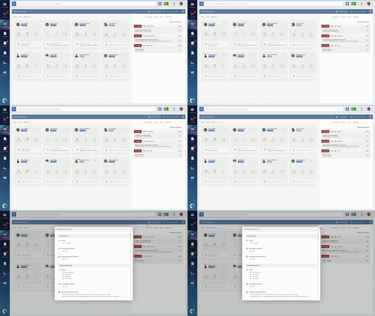
The Manager section in InvGate Service Management makes it easy for managers to know which agents are available and ready to take tasks with visual indications. Why? Because it’s not necessary - and quite impossible if they manage a numerous IT support team - for them to remember all the service desk hours, holidays, and individual needs.
7. Jakob’s law
The last law of UX we’ll tackle here puts people at the center. The thing is that users love user interaction patterns that are familiar to them. And though this might seem like a limit to innovation, the truth is that no matter how creative you are, at the end of the day you want your tool to be used. Implementing some patterns well-known to the user reduces friction and increases the chances of adoption.
After so many years of doing things a certain way, users expect some things to happen or to be located in certain places. That’s why we use a very well-known drag-and-drop assignment of tickets in InvGate Service Management. It works just like moving files around in an OS, or how modern websites allow uploading images via drag-and-drop.
Key takeaways
The laws of UX are nothing more than helpful guidelines to choose a product or create custom solutions. Abiding by them increases the chances of adoption since they are based on utility, ease of use, and efficiency notions.
In short, whether you’re on the creator or the user side, to make a wise decision about a tool, consider the following:
- First impressions are a big deal.
- Speed is key.
- A bit of order is also relevant.
- Targets should be easily spotted and accessible.
- Choices shouldn’t be overwhelming.
- Users’ memory is not infinite.
- And they love familiar things.
Remember: functionality, integrations, and needs are not the only pillars to base a decision. Include the laws of UX and start making smarter choices. They’ll definitely pay off in the long run!
