Everyday service desk operations are constantly producing an abundance of meaningful information. When used smartly, it offers a wealth of opportunities for optimizing processes.
Typically, IT Service Management (ITSM) software comes with built-in analytics that cover most of the necessities for a help desk manager. However, there are some cases where they might need to cross-reference multiple databases, some inside the tool and others outside it.
If you’re currently in that scenario, we have a solution for you: you can use InvGate Service Management API to connect it to your favorite data visualization tool and create customized Tableau or Power BI service desk dashboards.
Keep reading to see in which cases this might come in handy!

What is data visualization?
Data visualization refers to the graphical representation of information, indicators, or statistics through visual elements. This includes charts, graphs, maps, and other visual aids. It seeks to present complex or large datasets in a visual format that is easy to understand and analyze.
Implementing effective data visualization not only simplifies complex information. It also provides a clear and concise way to convey information to both technical and non-technical audiences, allowing teams to make informed decisions and draw meaningful conclusions.
10 common types of data visualization

Full disclosure, you don’t need tools exclusively oriented to visualization in order to present your data in a visual way. As we mentioned above, that can be done with built-in InvGate Service Management features.
Regardless of the solution you’re using to visualize your data, you can always choose among the following options to analyze it. Selecting the appropriate one will depend on the specific insights you're seeking and the nature of your service desk information.
- Line charts - They illustrate trends and changes over time, making them ideal for tracking response times, ticket volume, and resolution rates.
- Bar charts - They compare data across categories, such as tracking the number of tickets by category or priority level.
- Pie charts - They display the composition of a whole, such as the distribution of ticket types or the ratio of resolved to unresolved issues.
- Heatmaps - They help you visualize data density and patterns, allowing you to identify peak service desk activity hours or common ticket submission times.
- Stacked area charts - They highlight cumulative data trends, showing how different service agents contribute to ticket resolutions over time.
- Scatter plots - They are ideal to explore correlations and relationships between variables, helping you understand if there's a connection between response times and customer satisfaction ratings.
- Gantt charts - They are used to the lifecycle of tickets or projects, showing their start, end, and various stages in between.
- Donut charts - Similar to pie charts, they display the proportions of a whole, but they can also showcase multiple layers of data, like the distribution of issues by category and priority.
- Treemaps - They are a great way to visualize hierarchical data, like the breakdown of issues by department, enabling you to see the distribution of tickets within broader categories.
- KPI dashboards - They combine multiple visualizations to provide an overall view of key performance indicators (KPIs), helping you monitor service desk performance at a glance.
Why do you need data visualization and analysis in your service desk?
Service desk operations are constantly producing information. But it’s one thing to accumulate it just because it’s there, and another to collect it in an organized way. The latter provides you with an organized way to gather, analyze, and display that information. Thus, supporting your decision-making.
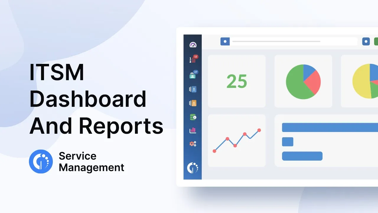
For that reason, InvGate Service Management comes with built-in dashboards and reports so that managers and agents can quickly filter data, visualize what they need the way they need it, and act upon it.
However, this capability only applies to your service desk information. And, as we all know, that’s not the only database a manager – especially in a big company – needs to work with periodically. Isolated information silos can make the daily work a bit tricky since users have to go back and forth between large sets of information and are unable to cross-reference it.
That’s exactly what the possibility to export your InvGate Service Management information from our platform and into data visualization tools such as Power BI through our API comes to solve.
The API responds to a “star” model that allows you to export information in a JSON format to later cross-reference with other data sources.
Now that you know how it works, let’s see what it can be useful for.
5 data visualization examples
In general, InvGate Service Management’s data visualization features can accommodate most manager’s needs. Especially if we keep in mind that it allows data specialists to build customized reports and dashboards. So, it’s more than enough for daily operations.
But we’re here to talk about why they might need to go one step further. It’s time to see why a Power BI service desk dashboard can be useful.
- Mapping customer satisfaction - If you’re looking to support targeted improvements, you can combine InvGate Service Management’s customer feedback survey results with the customer interaction history from a CRM. By doing so, you can identify the correlation between service quality and satisfaction levels. To address this better, use scatter plots or heat maps that can display relationships between response times and satisfaction scores.
- Optimizing resource allocation - Creating dashboards that combine ticket data from InvGate Service Management and resource availability from Project Management tools can highlight instances where resource allocation isn’t aligned with demand. This ensures timely issue resolution. Try using stacked area charts or Gantt charts to help visualize resource utilization over time.
- Federating multiple sources of information - This is ideal for managers looking to estimate workloads and work on service skills. To build this business analytic dashboard, combine InvGate Service Management metrics like Ticket Volume, categorization, and sources with your phone system data, such as your ACD (Automatic Call Distribution) or IVR (Integrated Voice Routing). This will show call metrics like average speed to answer, average handle time, and other measures alongside tickets.
- Timekeeping - If you have a larger or global team, it’s important to keep a dashboard to match payroll and time systems in the same view as work time metrics on InvGate Service Management. To analyze this integrated data, try using interactive pie charts.
- Measuring service performance - Your service delivery not only depends on the information provided by the service desk. Your external services and products also give you metrics that can impact it. So, it’d be advisable to build a report that cross-references all those data sources to determine what you need to adjust for scale and to highlight major problems.
7 best practices to build a Power BI service desk dashboard
Creating effective Power BI dashboards for your service desk requires thoughtful planning, strategic data integration, and skillful visualization techniques. Here are some best practices and tips to help you build a dashboard that delivers actionable insights:
- Define a clear scope - Rather than overwhelming users with excessive data, concentrate on essential metrics that align with your service desk goals.
- Define variables for consistency - Establish variables or calculations within Power BI to maintain consistency and accuracy across metrics. For instance, if you're calculating average response time, define the formula as a variable to reuse in different visuals, ensuring consistency throughout the dashboard.
- Leverage interactive information - Utilize slicers, filters, and drill-through actions to enable users to explore data from different angles. They enhance user engagement and allow stakeholders to extract specific insights relevant to their needs.
- Create a storyline - Arrange your visuals to tell a cohesive story. Structure the dashboard logically, guiding users through the data analysis process. Start with an overview, delve into specific metrics, and conclude with actionable insights or recommendations.
- Choose appropriate visualizations - Select visualizations that effectively convey the insights you want to communicate. Consider the data visualization types mentioned above.
- Maintain a consistent visual hierarchy - Place the most critical KPIs prominently in the dashboard, ensuring that users can quickly grasp the dashboard's key insights. Use color coding and formatting consistently to enhance readability.
- Utilize Power Query for customization - This feature enables you to connect, transform, and clean data from various sources before loading it into Power BI. Use it to combine data from InvGate Service Management, and other sources, ensuring that the data is consistent and accurate for visualization.
Key takeaways
Though Power BI service desk dashboards are only advisable for a handful use cases, they are crucial when you need to cross-reference multiple data sources. InvGate Service Management’s API facilitates the extraction of information from your IT support operations so that you can build more complex dashboards.
But remember that, if you don’t have massive amounts of data to analyze, its built-in reporting capabilities are more than enough to power through. But don’t take our word for it; try it for free for 30 days and see it for yourself!


![ITSM RFP Template [Guide and Free Download]](https://blog.invgate.com/hs-fs/hubfs/it-service-management-itsm-rfp-template.jpg?upsize=true&upscale=true&width=780&height=205&name=it-service-management-itsm-rfp-template.jpg)

