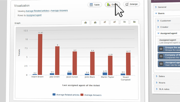
Any Service Desk worth its salt needs a custom reporting tool, and InvGate Service Desk is no exception. Some ITSM tools take the Mechanical Turk approach to custom reports, and give you a virtually infinite list of simple, predefined reports:
Others go for the opposite approach and give you more options, but the results can sometimes be puzzling.
In all cases, the resulting reports are static snapshots, allowing no further interaction with the data. This is a severe limitation that was acceptable 10 or even 5 years ago, but in the times of big data, we expect more of our systems. Users want powerful tools and simple interfaces. Smart UIs that are context sensitive and make sane decisions (or at least pick sane defaults for you).
Of course, creating a simple UI for something as complex as a Service Desk custom reporting tool is not an easy feat. There is a virtually infinite amount of reports that people might want to see, and packing all that information in a way that is both easy to handle and easy to understand has proven challenging.
Oh, and fast, too.
Moreover, if we want to enable our customers to discover information on-the-fly, performance has to be up to the task. Waiting 15 seconds for a report to load kills the opportunity for interactive navigation. And research has shown that you can only hold around 7 elements of information for less than 30 seconds. This means that if you find something interesting and want to see more (say, if you discover a performance issue for a specific part of your helpdesk), it’s crucial that you are able to do this very fast. Otherwise, you will lose track of what you were doing, or won’t be able to easily compare the drill-down information with the larger perspective you were seeing before.
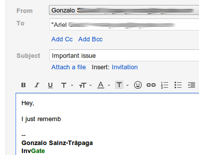
Not only that: in a Service Desk environment, interruptions are the norm. You must speedily and eagerly react to any event that needs attention. So your whole environment is conspiring against any opportunity you might have of a calm, 3 hour session with a custom reporting tool. If you are anything like me, you find stuff like this among your drafts when you are tidying up your Inbox:
Hence, information, easy, and now.
So?
Luckily the business world pioneered this type of need ages ago, with retail businesses carrying the flag (and others following) in the use of what the industry calls Business Intelligence tools. The main point of the business intelligence industry is delivering systems that focus on the analysis side of information systems, as opposed to the operational side. Once your cash registers know how to tell your billing system how much money you made (the operational side), you need to know how (and hopefully why) you are making that money (this is the analytical side).
Databases meant for analysis fall under the umbrella of OLAP (On Line Analytical Processing), as opposed to OLTP (On Line Transactional Processing), the traditional approach involving normalization and other fancy techniques meant to improve transactional performance. OLAP databases are specifically designed for reporting.
Enter dimensional modeling.
But how does it work?
Dimensional modeling is all about performance and ease of use, a great fit for InvGate Service Desk! The main idea is that you think about your data in terms of metrics and dimensions.
- Metrics are things you want to measure (such as a ticket count, or a response time)
- Dimensions are criteria you can use to group and aggregate metrics (such as a ticket category, request type or priority)
In these terms, a typical ticket per category report has one metric (ticket count) and one dimension (category). You may be familiar with this approach if you use Excel’s pivot tables, or any data warehousing systems with an OLAP client such as the great Tableau.
The main advantage over the traditional approach is not even the looks or the ease of use. It’s the interactivity. Because changing views is done in real time, you can actually navigate through information in a meaningful way. You don’t just look at things, you can find things that are worth looking at. Precisely what you can’t do with a traditional report.
So that’s it.
We went ahead and built it, in full InvGate style. You can even see a video demo of InvGate Service Desk Analytics on our website.
The cool thing is that because we understand the problems of ITSM, we already pre-baked a ton of domain expertise into the tool. Unlike generic OLAP tools, InvGate Service Desk’s Analytics already knows what a ticket is, and what the most frequently used dimensions are (request types, categories, priorities). So the entire user experience is super smooth.
Of course, if you are a hardcore analytics geek you can also plug Mondrian or your favorite OLAP browser directly to the database and take advantage of our embedded data warehouse however you see fit.
Some quick facts:
- The ticketing data warehouse in InvGate Service Desk has now over 30 metrics and 50 dimensions
- That yields over 73500 simple, highly meaningful reports that you can graph in 2D1
- We also threw in a number of additional metrics that are usually impossible to extract from traditional report tools, but are highly relevant to ITSM:
- average customer waiting time in between replies
- count of replies that were hidden to customers
- number of reprioritizations for each ticket
- collaboration between agents
- You can edit, filter, graph and drill down with your mouse
Wrap it up already, man!
Whenever we start work on a new feature, we look at our customer’s needs, our own experience, the state of the art and the state of the market. We always try to surpass expectations in one way or another, be it through an innovative UI, a different workflow or a distinctive approach altogether.
We set out to give our customers access to a mind boggling amount of information with an intuitive interface, and we delivered. They are already loving it. You get so much visibility into your Service Desk that you can tell our usual demo instances are auto generated from a mile away2.
Kudos for the team on this one!
If you want to see it in action, contact us for a demo or subscribe to a webinar (until we sort out the live demos!)
Footnotes
- And around 8067425200348991779579012346251694062277392217068796168459919854231774570741760000000000000000000 in total, but who’s counting?
- True story! We are not providing a live demo yet since showing this functionality requires a non-trivial amount of data in the system so that there’s something worth seeing, and our demo data generators are very limited at the time


