
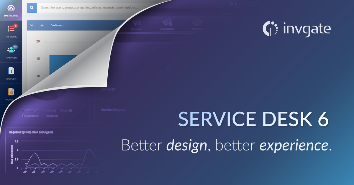
We’re very happy to introduce InvGate Service Desk 6.0, a version that features a totally renewed interface to continue making your life at work easier (and more organized).
The goal we set ourselves was to improve the experience of all those who use InvGate as their main work tool: Agents, Managers, and Administrators now have more visibility on pending tasks with the option to operate them in a simplified way, all from the same screen.
The star of this major redesign is the "My work" section, where the technical users spend most of their time organizing their day to day. Keep reading to learn about all the changes and improvements that this new interface brings.
What changed exactly?
Mainly, the use of the full screen width, along with a style update, following the latest trends in software design.
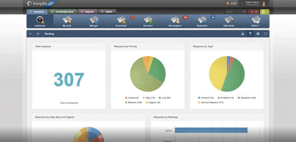
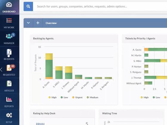
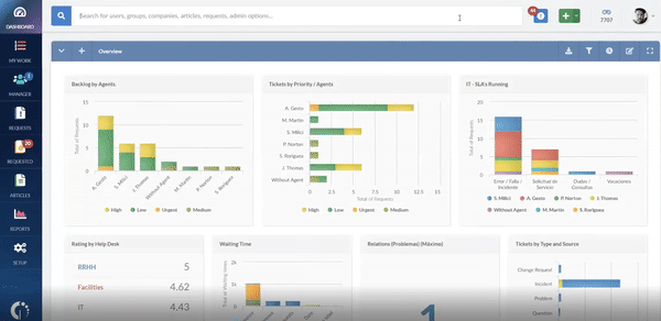
InvGate Service Desk previously had a fixed width that prevented us from seizing all the available space on a screen; now we take more advantage of it, to show more information at a glance. For example, screens where three graphics used to appear, now show up to five.
In addition, the main menu is now vertical:
"My work", totally renewed
We put a lot of focus on having everything you need in this section. It’s the starting point for your work, with indicators that are automatically updated, shortcuts and quick actions that you can execute in a click, and a much more comprehensive overview.
We redefined the way to work with Service Desk, in order for it to be more effective and solve requests with fewer clicks.
Below we list some of the most visible changes:
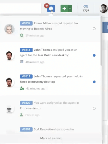
- Cards view – cards can be requests, tasks, or requests for approvals, for example. The goal of this new visualization is that at first glance you have an idea of what’s behind each case, and take quick actions on each card. We've also added the concept of "Upcoming" on the right corner, where you will see all events coming up - tasks that are due soon, approvals about to expire, reminders, etc.
.png?width=687&name=image%20(19).png)
- Search – a more visible search bar to filter requests by keywords, users, content, and other variables.
- More control over notifications – now you can mark one, several or all as read or unread; before, when opening the list of notifications and closing it again, they were all marked as read.
What about End Users?
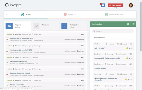
Your customers or end users will simply see a renewed design of their same interface; this is simply the design style, nothing application-wise has changed place for them, so you don’t need to train them again.
There are two visual changes:
- The button to create a request, located in the upper right corner, is now much more visible: a red call to action.
- There's now a direct access to the Knowledge Base from the Home screen.
Both can be seen in the following image:
What was the purpose of this project?
As you know, one of our main differentiators has always been our attractive interface that leads to a highly positive user experience. With the job of the service desk getting harder and harder thanks to the likes of digital transformation and increasing business pressure, we need to continue to ensure that we make your life as easy as possible when it comes to technology.
We can identify two major improvements in the experience:
- A better understanding of what's happening, as in the first contact with the information you have more details at a glance.
- A better work organization, as the cards offer new ordering criteria (by priority, date, status, category, etc.).
And that’s not all...
We still have more improvements to make when it comes to our UI. Next versions will incorporate a table-like visualization for "My work", so that you can add columns to your choice, as well as order them, filter them, and execute mass actions. For example, close 10 requests at once.
Afterwards, the request timeline will be completely renewed, including its main information and its history. So stay tuned, and don’t miss our product updates in the coming months!
As always, at InvGate we’re very committed to improving our users experience, so we hope you enjoy this new version as much as we enjoyed developing it.
We thank all the customers who gave us their feedback, since their contributions inspire our decisions and motivate us to continue delivering a quality product that meets business needs and expectations.

Want more details?
To learn how to update to the latest version or for more information on how this version impacts your current instance, please read our Frequently Asked Questions (FAQ). In addition, we have a document that details a before and after of each visual change.
If you want to explore the new interface before updating, please access our online demo.
If you have any questions or comments, write us in the comments section below.